
Creative workflows • Lindo field notes
How to Turn a Brand Moodboard into a Website Design System
Translate visual references into typography, color roles, spacing, imagery, and component rules that an AI builder can apply consistently.
The short answer
Extract design decisions from the moodboard instead of asking AI to imitate the whole collage. Define color roles, typography behavior, spacing, image treatment, and a few component rules. Test those rules on a hero, a dense content section, and a form before applying them to the whole website.
In this article
A moodboard can feel coherent while being impossible to build. One reference has oversized editorial type, another uses delicate pastel text, and a third relies on dramatic full-screen photography. Asking AI to combine all of them often produces a visually busy page with no stable logic.
The bridge from inspiration to a website is a small design system. You do not need an enormous component library. You need enough explicit decisions that the next section looks related to the first—and remains readable when the content gets less glamorous.
FIELD NOTE / 01
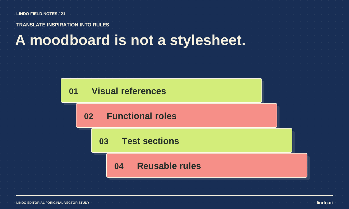
Name what each reference contributes
Annotate the moodboard with one useful property per reference: image scale, typography contrast, color restraint, or navigation simplicity. Mark elements you do not want copied. This makes the references directional rather than prescriptive.
For a fictional ceramic studio, you might choose warm paper tones, dark ink text, irregular product photography, and quiet navigation. That does not require reproducing another studio’s logo, composition, or product imagery. Use assets you own or have permission to use.
FIELD NOTE / 02
Assign roles to colors and type
A palette becomes usable when colors have jobs. Choose a primary text color, background, muted surface, action color, and border treatment. Check contrast in the actual combinations rather than assuming a beautiful swatch is readable.
Likewise, define heading behavior and body readability. An expressive display face may work for a short title but fail in a long service heading. Specify a small type hierarchy and test it with the longest realistic wording.
| Moodboard impression | Website rule | Stress test |
|---|---|---|
| Warm and tactile | Paper background with restrained texture | Body text remains clear over the surface |
| Quiet confidence | One strong heading style, plain body type | Long headings wrap without clipping |
| Handmade variation | Uneven image crops within a consistent grid | Gallery remains usable on a phone |
| A single vivid accent | Accent reserved for important actions | Secondary controls do not compete |
FIELD NOTE / 03
Build three test sections before the whole site
Create a hero, a dense information section, and a form. The hero tests composition. The dense section tests whether the design can carry real explanations. The form tests labels, focus, errors, and action hierarchy.
If the system only works with a two-word headline and three short cards, it is not ready for real content. Fix the rules now rather than making each later section a special exception. This is where a modest design system prevents the generated site from drifting.
FIELD NOTE / 04
Brief AI with rules and permitted variation
Tell the builder which choices are fixed and which can vary. For example, keep body typography, action styling, and spacing rhythm consistent while allowing different image arrangements across project pages. That gives the design room to breathe without losing coherence.
Ask for explanations tied to function: why a section is full-width, why a caption sits below an image, or why a button is more prominent. Do not reward decorative complexity that makes the visitor’s task harder.
FIELD NOTE / 05
Review the system with real content
Replace sample text and images before approving the design. Inspect a phone-sized layout, enlarged text, keyboard focus, and contrast. W3C’s introductory checks can help structure an initial review, but they are not a full accessibility audit.
Save the accepted rules with examples of both correct and incorrect use. Future AI revisions should consult that reference rather than reinterpret the original moodboard every time. See making AI websites less generic for the editorial decisions that give those rules a distinctive purpose.
Take it into your next project
Moodboard-to-system prompt
Attach only references you can appropriately use. Ask for extracted properties, not a replica of someone else’s website.
Translate these references into a small website design system.
For each reference, name the property to learn from and what must not be copied.
Define: background/text/action color roles, type hierarchy, spacing rhythm, image treatment, borders, and focus styles.
Use real supplied content to create three test sections: hero, dense explanation, and inquiry form.
Keep body readability and action clarity ahead of decorative effects.
State fixed rules and allowed variation.
Flag inaccessible color combinations or layouts that depend on unrealistically short text.
Common questions
Can I ask AI to copy a moodboard website?
Use references to describe properties and direction, not to reproduce another business’s identity or protected assets. Build a design suited to your own content and audience.
How many colors should I use?
There is no universal number. Start with a small set of functional roles and add a color only when it serves a clear purpose. Test the actual combinations for readability.
Sources & further reading
Vendor links support product descriptions. Worked examples, checklists, and selection criteria are Lindo’s editorial guidance; they are not customer results or controlled benchmarks.
Creative workflows
How to Make AI Websites Look Less Generic
Replace default hero-and-card layouts with a clear editorial idea, distinctive evidence, varied section rhythms, and useful original visuals.
Choose your tools
Best AI Tools for Website Images: Match the Tool to the Visual Job
Choose between ChatGPT image generation, Adobe Firefly, and Canva—and learn when a real photograph or SVG diagram is the better website asset.
Build with AI
How to Write a Website Brief for AI That Produces a Useful First Draft
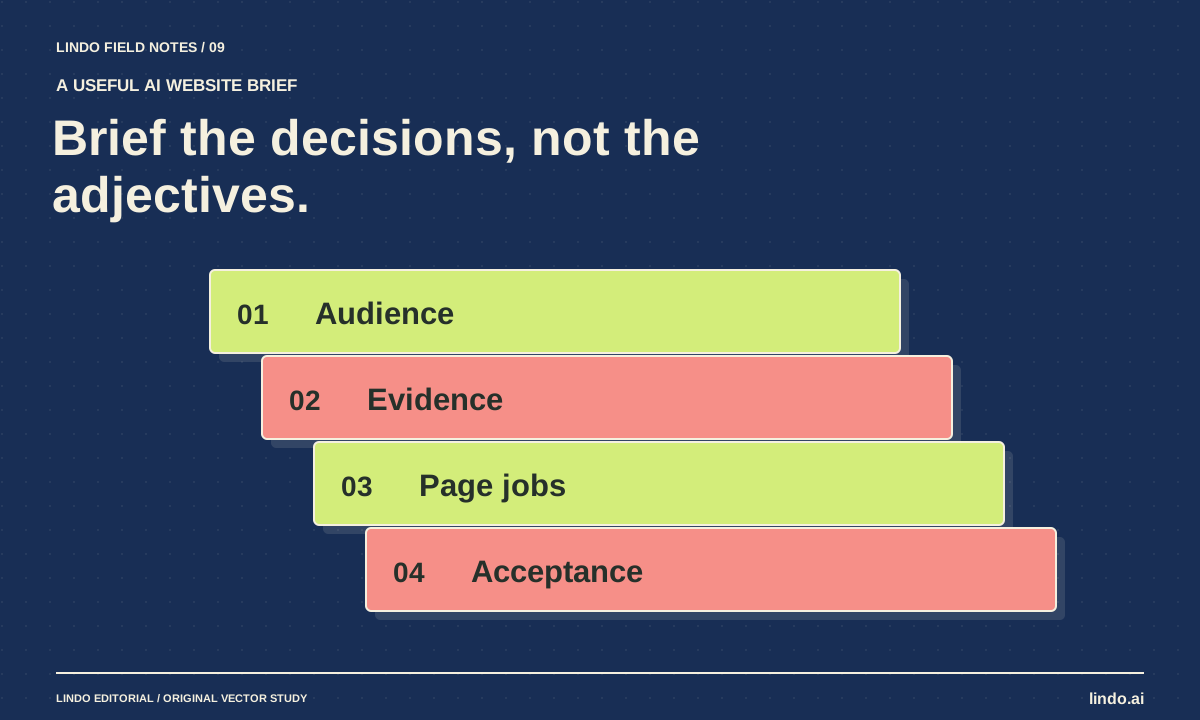
Replace vague website prompts with an approved brief covering audience, facts, page jobs, visual direction, and acceptance checks. Includes a copyable template.