
Creative workflows • Lindo field notes
How to Make AI Websites Look Less Generic
Replace default hero-and-card layouts with a clear editorial idea, distinctive evidence, varied section rhythms, and useful original visuals.
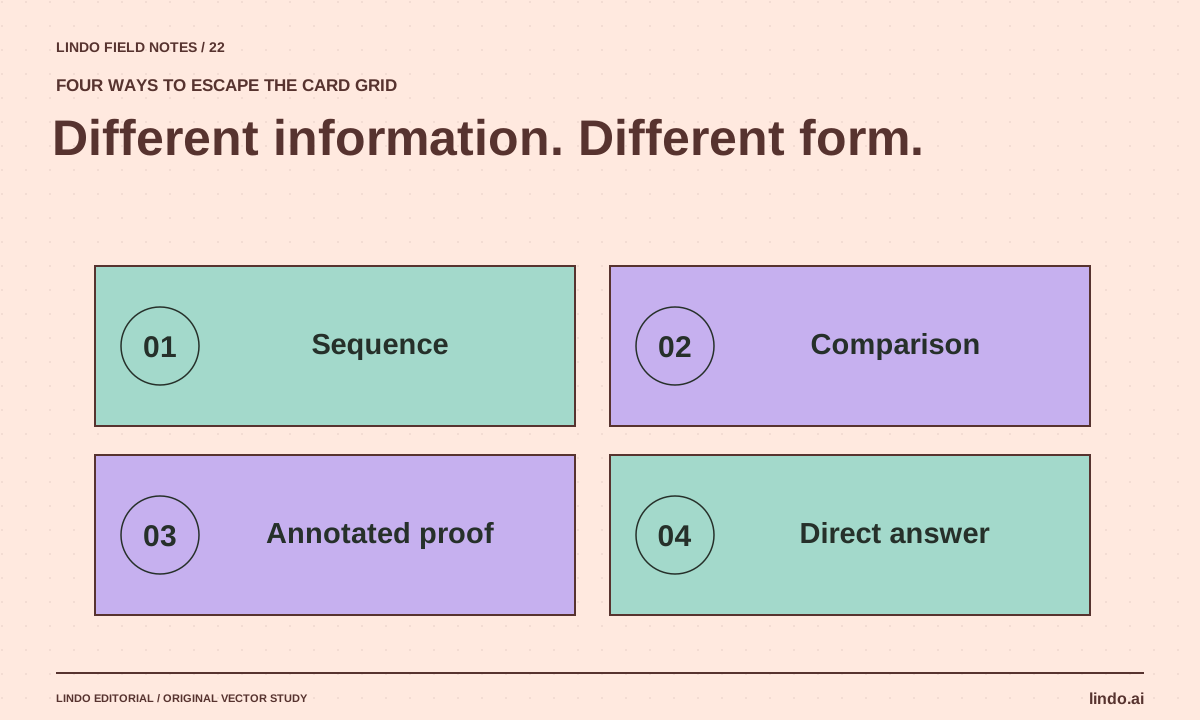
The short answer
Give the site a specific editorial idea, use real evidence, and vary layouts according to the content’s job. Define a restrained visual system, replace generic imagery, and remove sections that say nothing new. Distinctiveness comes from meaningful decisions, not from adding more gradients, animation, or unusual shapes.
In this article
The generic AI website is easy to recognize: a broad promise, a glowing button, a row of invented-looking logos, and six cards with almost identical sentences. The problem is not one forbidden layout pattern. It is that the page has no point of view about what matters.
A site becomes distinctive when its content and visual choices belong to a particular business. A bicycle workshop, a tax adviser, and a ceramics studio should not differ only in accent color. Their evidence, customer questions, and rhythms of explanation are different.
FIELD NOTE / 01
Choose one editorial idea that the business can support
For a repair shop, the idea might be “show how the diagnosis works.” For an illustrator, “show the decisions behind the work.” For a consultant, “make the engagement understandable before asking for a call.” This idea should influence what the page includes and what it leaves out.
Do not confuse a slogan with an editorial idea. “Empowering your success” gives no direction to a designer. “Explain the three decisions we help a new retailer make before opening” suggests a useful diagram, concrete questions, and a clear page structure.
FIELD NOTE / 02
Replace generic proof with specific material
Use actual project details, process photographs, annotated examples, or a worked explanation. If customer results are unavailable, describe the process honestly rather than manufacturing statistics. A clearly labeled concept can still demonstrate design judgment.
A useful before-and-after might show how a confusing service explanation became clearer. It should not claim increased revenue unless that outcome was measured and can be attributed responsibly. Specificity is not permission to invent numbers.
FIELD NOTE / 03
Let different content use different structures
Use a sequence for a process, a comparison for a choice, a large image for visual evidence, and prose for an argument. Repeating cards for every section makes different ideas look equally shallow. Layout variety should reflect information, not random novelty.
| Content job | Useful structure | Common weak substitute |
|---|---|---|
| Explain a process | Numbered sequence with decision points | Four vague benefit cards |
| Help choose an option | Compact comparison with tradeoffs | One-sided promotional list |
| Show work | Annotated image with context | Decorative stock photo |
| Resolve an objection | Direct answer with evidence | Another broad promise |
FIELD NOTE / 04
Use a restrained visual language with one memorable move
Choose a coherent palette and typography system, then allow one distinctive compositional idea: an oversized editorial index, an annotated workshop image, or a carefully drawn process map. The rest of the page should support reading and action.
Avoid using every available effect. A floating shape, animated gradient, noisy texture, and rotating headline can compete with the business itself. Check whether removing an effect improves the page. If so, it was probably decoration without a useful role.
FIELD NOTE / 05
Run the substitution and deletion tests
Replace the business name with a competitor’s. If most of the page still works unchanged, identify the missing specifics. Then remove one section at a time. If nothing meaningful disappears, that section probably needs stronger content or should go.
Finish by checking the page at phone width with real wording. Distinctive design is not successful if it obscures the offer or hides the next action. Use the moodboard-to-system guide to preserve accepted choices across future AI revisions.
Take it into your next project
A non-generic redesign brief
Apply this to a private draft after approving the business facts. Ask for reasons, not just a new visual theme.
Editorial idea: [one specific thing this business should explain or demonstrate].
Keep approved facts and working integrations unchanged.
Audit each section: what new information does it add?
Replace generic claims with supplied evidence or explicit unanswered questions.
Use different structures for process, comparison, proof, and objections.
Visual direction: [palette roles, typography, imagery, one distinctive compositional idea].
Avoid invented logos, reviews, metrics, and decorative effects without a purpose.
Return the revised structure and explain why each section earns its place.
Common questions
Are gradients and cards always bad?
No. They are ordinary design tools. The problem is using them as substitutes for meaningful content or repeating the same structure regardless of the information.
Can a template-based site still be distinctive?
Yes. Strong content selection, real imagery, deliberate typography, and a clear visitor journey can create a distinctive result within a template. Novel code is not a prerequisite for good judgment.
Sources & further reading
Vendor links support product descriptions. Worked examples, checklists, and selection criteria are Lindo’s editorial guidance; they are not customer results or controlled benchmarks.
Creative workflows
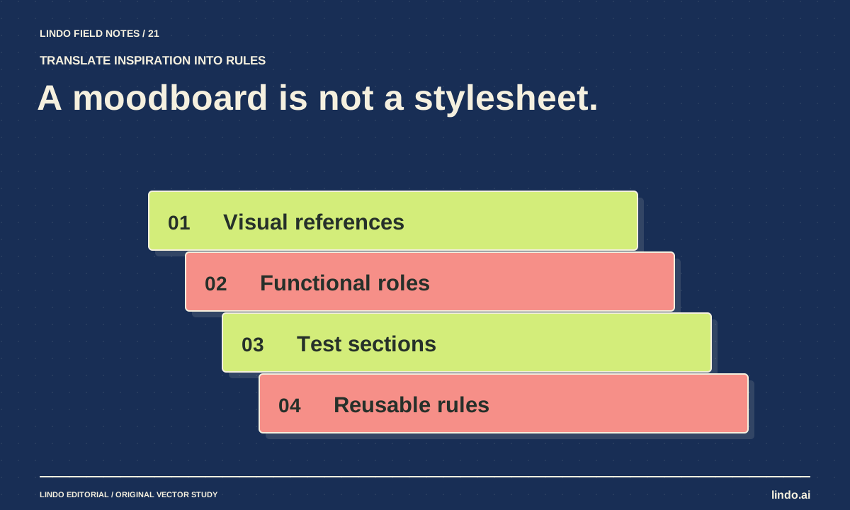
How to Turn a Brand Moodboard into a Website Design System
Translate visual references into typography, color roles, spacing, imagery, and component rules that an AI builder can apply consistently.
Choose your tools
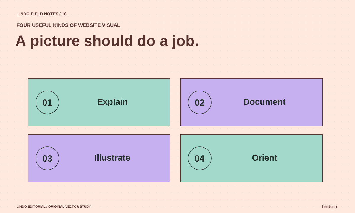
Best AI Tools for Website Images: Match the Tool to the Visual Job
Choose between ChatGPT image generation, Adobe Firefly, and Canva—and learn when a real photograph or SVG diagram is the better website asset.
Build with AI
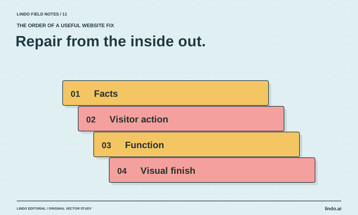
How to Fix an AI-Generated Website Without Starting Over
Diagnose weak AI website drafts in the right order: facts, visitor journey, functionality, layout, and visual polish. Includes a focused repair prompt.