
Best website mockup tools: present client work without hiding what still needs testing
A good mockup gives a client enough context to understand a design. A bad one makes an unfinished page look approved. Choose a tool that supports the presentation you need while keeping the working website easy to inspect.
Which tool fits your workflow?
Evaluate MockupX for website and email screenshot presentation, Shots for designed screenshot and mockup assets, and Rotato for device-focused 3D stills or motion. None of these presentation formats replaces testing the actual website.
| Tool | Evaluate it for | Check before choosing |
|---|---|---|
| MockupX | Website and email captures presented in device context | Capture freshness, responsive states and export dimensions |
| Shots | Designed screenshot assets and mockup compositions | Available layouts, output formats and editing control |
| Rotato | Device-focused 3D stills and motion mockups | Platform support, scene control and rendering needs |
Where MockupX fits
MockupX is a browser-based screenshot mockup editor with device, browser, social and app-store compositions. It supports adjustable framing and exact-size PNG or JPEG exports. Its public site distinguishes a free starting plan from Pro export and workflow features. A presentation mockup is not a responsive or email-client rendering test. Product source ↗
- Good fit
- Agencies preparing client proposals, portfolio images, newsletter presentations or launch visuals from screenshots they have permission to use.
- Not the job
- A replacement for testing a live website, proof that an email renders correctly in every client, or an excuse to represent a concept as a deployed customer result.
- Budget for
- Check the current export, watermark, resolution and commercial-use terms for the plan you choose. Include source preparation and revision time in the deliverable.
MockupX’s public positioning focuses on turning website and email material into presentation-ready mockups. For an agency, the useful question is whether the resulting asset clarifies a decision: approving a visual direction, comparing responsive layouts or showing a finished project in a portfolio.
Keep the source URL and capture date with the brief. A device frame can make an old screenshot feel current. Review the original page alongside the export and label unfinished content. If the client needs to approve navigation, forms or accessibility, send a working preview as well as the presentation image.
Other tools to consider
Shots: designed screenshot assets and mockup compositions
Shots presents tools for screenshot-based mockups and visual assets, including image and motion-oriented work. It is a useful comparison when the task is packaging a screen for a launch post, presentation or case study. Confirm which output and customization options are available in the version you plan to use.
Use the same screenshot in each candidate. Check text sharpness, padding, background contrast and whether the composition still reads at thumbnail size. A beautiful full-resolution export is not enough if the actual placement crops away the important part of the interface.
Rotato: device-focused 3d stills and motion mockups
Rotato documents 3D device mockups for still and motion output using supplied visual material. This makes it a relevant option for a more dimensional product presentation. Verify the current application and platform support before building a repeatable agency process around a particular version.
Reserve elaborate device movement for a communication need, not as a default treatment. A close, stable view may show a client’s new booking interface better than a dramatic rotation. Test one realistic scene and one revision so you understand both production effort and the cost of updating the asset later.
The source screenshot matters more than the frame
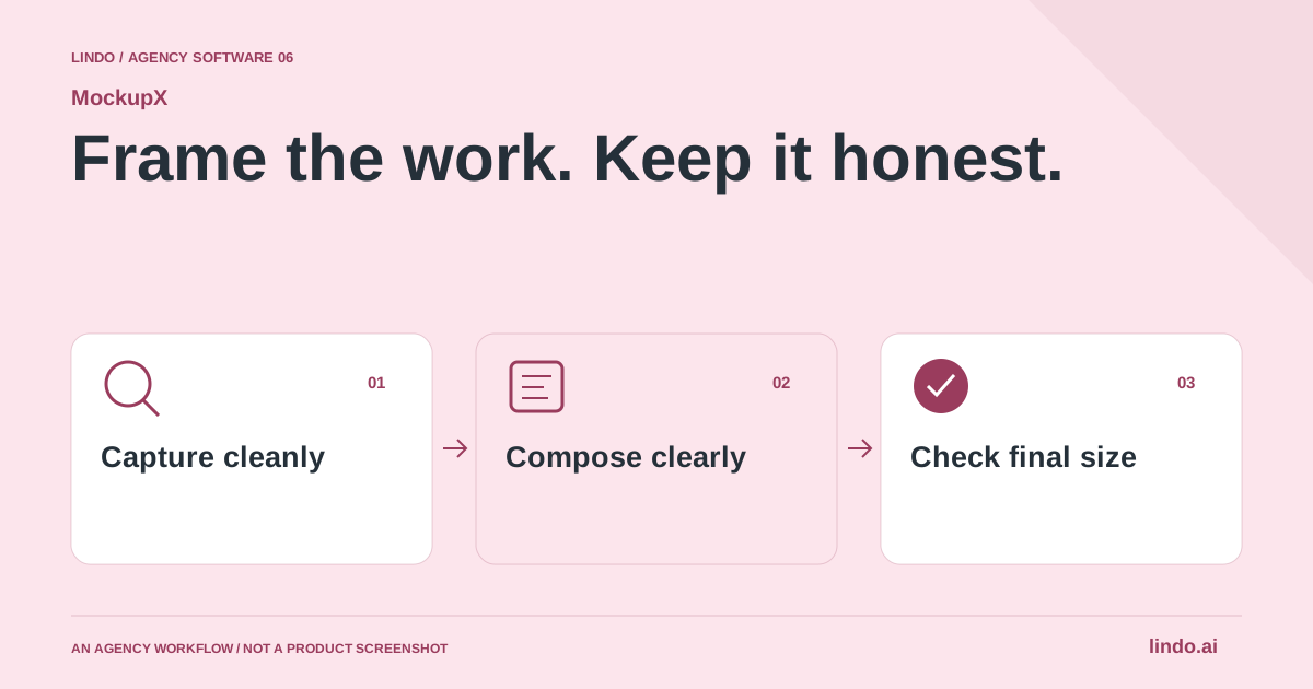
Capture the relevant task or section at a deliberate viewport size. Close cookie notices only when appropriate to the intended presentation, remove unrelated browser clutter and use approved demonstration data. Keep a full reference capture before cropping. That reference helps the team distinguish a deliberate composition choice from missing work when feedback arrives.
A screenshot of a long page is often too small to explain in one slide. Select a coherent portion, such as the first screen and its main action, then show detail views separately. If you need to show the full page structure, use a plain overview with clear labels. Do not ask the same image to communicate both overall hierarchy and the exact wording of a small form field.
Use email mockups for presentation, not rendering proof
An email shown inside a polished frame can help a client review hierarchy, tone and the offer. It cannot establish how the message behaves in a recipient's actual email application. Treat those as separate deliverables: a presentation image for discussion and test evidence from the clients and devices that matter to the audience.
For a newsletter proposal, show the subject or campaign context beside the composition and keep the primary action readable. Use realistic message lengths and a plausible image aspect ratio. A design that only works with a three-word headline or an unusually short customer name is not ready simply because its mockup looks balanced. Include the awkward content case in the actual template review.
Make multi-device compositions answer a question
A desktop-and-phone arrangement should show what changes between layouts. Capture the real responsive versions separately; shrinking a desktop screenshot into a phone frame does not demonstrate mobile design. Align the scene around one feature, such as navigation, booking or the service summary, so the client can compare the experience instead of admiring the devices.
Keep the secondary device genuinely secondary. Overlapping three screens with large shadows can make the most important interface unreadable. Start with a simple background, one dominant screen and enough negative space for a short caption. Add perspective only if it improves the story. For detailed approval, also supply a straight-on version without visual decoration.
Ask for feedback on the decision, not the decoration
Label the asset with its purpose and state: concept, revised proposal or captured live page. Ask a bounded question such as ‘Does the opening explain the service clearly?’ or ‘Is this the right order for the booking information?’ Open-ended approval requests often lead to comments about shadows and backgrounds while the offer remains unresolved.
Keep source files, export settings and approval notes together. When a client approves the content but requests a different color treatment, preserve the approved content while changing the composition. Distinguish feedback on the underlying website from feedback on the marketing image. Otherwise, a request to make the mockup larger can accidentally become a request to redesign the actual page.
Inspect the delivered image at its real size
Choose dimensions for the destination and check the resulting file, not just the editor canvas. Inspect small text, edges, contrast and the crop. For a proposal document, verify the image after it is placed in the document. For social, examine a phone-size preview. Compression or scaling later in the workflow can make a sharp source look soft.
A general design editor remains a good alternative when you need a complex custom layout, while a raw screenshot may be best for bug reports and factual approvals. A dedicated mockup tool earns its place when common device and platform frames make recurring presentation work quicker. The test is whether the client understands the work more easily, not how many effects were applied.
Worked example: one redesign, three honest assets
An illustrative deliverable set for an agency handoff.
| Asset | Purpose | Keep visible |
|---|---|---|
| Straight browser capture | Approve the actual page | Content, navigation and main action |
| Desktop + phone composition | Explain responsive presentation | Two real viewport captures |
| Cropped social visual | Introduce the project publicly | Project status and the relevant product detail |
One stylized mockup does not need to serve as design approval, responsive proof and launch promotion simultaneously.
Separate presentation approval from website acceptance
Decide what the mockup is asking the client to approve. Visual direction, page hierarchy and campaign artwork are valid presentation decisions. Functional acceptance needs a working page. Put the decision in the review message so an attractive image does not accidentally become sign-off on untested behavior.
Capture representative states: the first screen, one important lower section and a narrow viewport. Use realistic content lengths. A layout that only works with a short placeholder heading is not ready simply because it fits inside a device frame.
Agree on file dimensions and destinations before producing a set. A portfolio tile, proposal slide and social cover may require different crops. Check exports at the actual displayed size, and keep an editable source or a reproducible capture recipe for future updates.
A useful pilot ends with one approved image and a clear record of what remains open. Count revisions and export repair time, not just the speed of the first composition. The right tool makes the design easier to discuss; it should not add a new layer of ambiguity to the project.
Client-mockup delivery checklist
Use this for your own pilot. Notes stay in this page session and are not sent to us. Download before leaving; reloading clears the worksheet.
Questions before you start
Can a website mockup prove that a page is responsive?
No. It can illustrate a captured viewport, but responsive behavior must be checked on the working page at different widths and with realistic content. Share a live preview for functional review and use mockups for presentation.
Can an email mockup replace email preview testing?
No. It is a presentation image. Test the actual message in the relevant email clients and devices before sending a campaign.
Should every agency portfolio image use a device frame?
No. Use a frame when it adds useful context. A clean screenshot, cropped detail or annotated comparison can communicate the work more clearly.
Sources & review notes
Reviewed October 2, 2026 using public product documentation and, for the featured product, available source code. This is not a hands-on performance ranking. Examples are illustrative; companion workflows do not imply a native Lindo integration. Confirm current prices, limits and connections before committing to client work.
Try the workflow before you standardize it.
Bring a real brief, use the worksheet, and evaluate whether MockupX fits the work you need to deliver. Keep the product scope and the client’s expectations explicit.